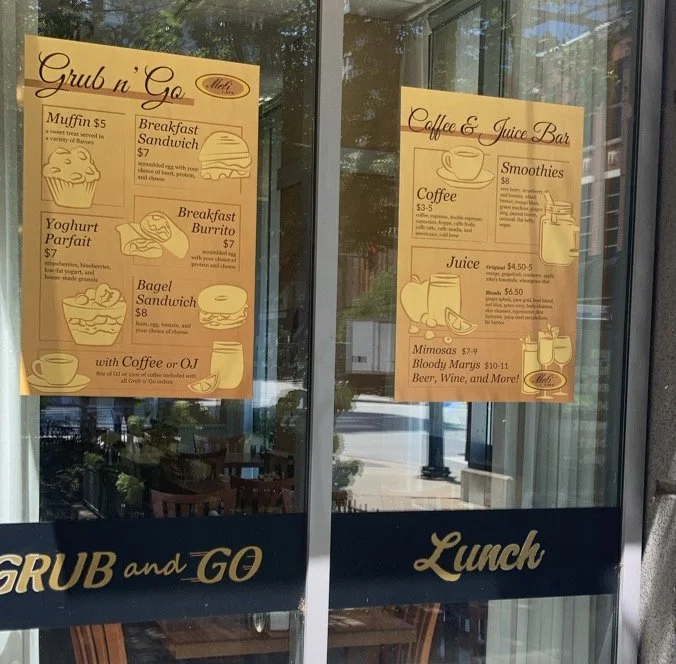
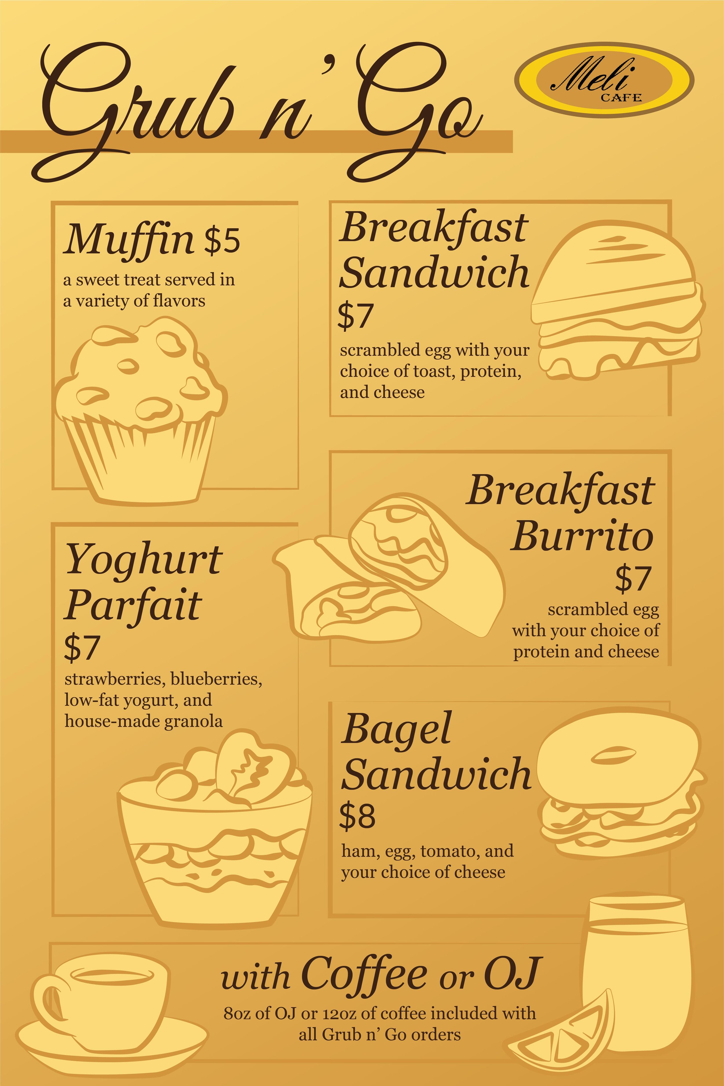
Meli Cafe Posters
Illustration
Client
Meli Cafe
Goal
Create a window cling to advertise Meli’s breakfast options and drinks to draw in customers
Strategy
Using illustration and bright colors, I created a design to catch the eye of passersby and become a conversation point to draw in more customers
Step 1: Analyzing the Brand
I wanted to capture the warmth and the homely feeling of their cafe and have illustrations that showed off what customers could actually expect. We decided on two posters, one for their quick, discount breakfast items (titled their Grub n’ Go menu) and one for their extensive drink options.
To start, I visited one of the cafes and spoke with the client about what they were looking for. They had a beautiful mosaic that pulled colors from the logo that I wanted to draw inspiration from for the poster. I also borrowed menus, looked through their website, and had some of their Grub n’ Go options for a drawing reference (and a delicious meal).
Step 2: First Round of Sketches
To start, I did sketches of the different items that would be advertised on the posters. Since there were a variety of items, I focused on simplifying the shapes of the more complex foods and adding elements to the drinks to make the set feel cohesive. In the final design, I wanted the viewer’s eye to take in each element and flow across the entirety of the poster without getting caught anywhere.
Step 3: Layout Ideation
When planning the layout, my goal was to have the illustrations be big and visually dominate the poster without the design feeling cramped or overwhelming. Each item should have its own moment without upstaging the others, which means more simplistic layouts would work well, but I also had to keep in mind the different illustrations would take up different space.
Step 3: Moving to Digital
-

Color
Grabbing colors from their logo, I started with three colors and built a broader palette with a greater difference in values to allow for stronger contrast.
-

Line Weight
Transferring my sketches to digital, I played with different weights and line treatment to allow the simpler shapes to have more visual interest and to keep everything cohesive.
-

Fonts
Since the client didn’t know the typeface from the logo, I found a close match with one called Groovy Vibes and chose Georgia as a secondary typeface for its elegant serifs and readability.
Step 4: Rough Mockup
With a handful of illustrations and the information I was given, I was able to put together enough of the poster to have the customer review and request changes.
With the drinks each having a list of options, I knew I wanted descriptions for the Grub n’ Go options, so I spoke with the client and decided that brief descriptions of the ingredients/options would best fill the leftover whitespace.


